When complex systems are not hidden or disguised,
like in Sanyo Bank's dealing room in Tokyo, the geometry and atmosphere of the space
is determined by the technology rather than a designer. But architecture really doesn't
have a language for unstable contexts of this kind, especially for ones like airports
where large numbers of people are passing through. In his new book Architecture
and Disjunction, Bernard Tschumi is scornful that "three thousand years of
architectural ideology have tried to assert that architecture is about
stability, solidity, foundation, when its the very opposite: like modern
scientific knowledge, buildings are constantly on the verge of change." And as
Donald Schon said in The Reflective Practitioner (1971), considered a
definitive statement about the nature of architecture, "design is now
increasingly taking place beyond the stable state."
Some architects have, it is true, attempted to design buildings that express
changeable-ness. But even these exciting projects by Rem Kolhaas and Jean
Nouvel look to me like traditional buildings with computer-like images
projected onto their surface. I'm not convinced the forms and structure are as
revolutionary as the information technology they contain.
 Other ways of communicating complex ideas do exist and could prove useful to
architecture: maps, signs and media art. It's worth looking at those.
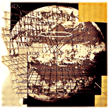
Cartography, for example, is one possible source of inspiration for
architecture since maps represent one of the fundamental tools by which we make
sense of the world. Traditionally, they mediate between an inner mental world
and an outer, physical world of which the reader may have no direct experience.
By that definition, maps sound like an excellent means for navigating vast
artificial environments like airports.
Other ways of communicating complex ideas do exist and could prove useful to
architecture: maps, signs and media art. It's worth looking at those.
Cartography, for example, is one possible source of inspiration for
architecture since maps represent one of the fundamental tools by which we make
sense of the world. Traditionally, they mediate between an inner mental world
and an outer, physical world of which the reader may have no direct experience.
By that definition, maps sound like an excellent means for navigating vast
artificial environments like airports.
The best maps and charts do inform you where you stand in relation to the
whole. But they can't convey a sense of movement, flow, or process -- the
invisible phenomenological reality that characterizes airports.
Nor is it the role of signs to reveal the fundamental structure of a system.
Their role is to control and optimize flow, to induce your movement in a
particular direction at a particular time. For humans, they are the graphic
design equivalent of the metal strips on the floor that guide robots around
automated factories. Don't get me wrong. I love good signs. When I arrive back
at Schiphol from any other airport in the world, I get real pleasure from the
sheer design quality of the banks of video information screens as well as those
large yellow signs. If one is going to be processed by a system, better to be
processed by an elegant, even beautiful system than a boring or ugly one.
But I reiterate that neither maps, which are representation, nor signs, which
issue instructions, can help us understand the system as a whole. Visual
displays explaining complex processes do exist. But neither airport operators
nor architects seem have thought about presenting information in this way to
the public.
The same cannot be said of artists. Throughout the century, artists have
created various kinds of "artistic space." Futurism, cubist collage, Duchamp's
readymades, Dadaism, Constructivism, Surrealism, Fontana's "Spatialism,"
"Happenings," Fluxus, Land Art, Arte Povera, Process Art, Conceptualism. These
groups all confronted the movement, energy, dynamism, and sheer process-ness
that modern man encounters in the modern places we have made. These artists
have treated the deadness and catatonia of modern public space both as a rebuke
and a challenge. Their aim has been to animate space, to give it a narrative
content.
 The use of color and light has been the subject of research by artists and
designers for decades. Such 'primary' design figured prominently on the Bauhaus
agenda. Why others besides artists do not use light dynamically in space is a
bit of a mystery to me. A fascination with words in space is a more recent
phenomenon among artists; Jenny Holzer's use of typography and digital displays
has particular resonance for anyone contemplating the notion of "semiotic
pollution" in relation to the sheer volume of information swirling around us.
Perhaps these are the first artists to have spent much of their lives staring
at departure boards.
The use of color and light has been the subject of research by artists and
designers for decades. Such 'primary' design figured prominently on the Bauhaus
agenda. Why others besides artists do not use light dynamically in space is a
bit of a mystery to me. A fascination with words in space is a more recent
phenomenon among artists; Jenny Holzer's use of typography and digital displays
has particular resonance for anyone contemplating the notion of "semiotic
pollution" in relation to the sheer volume of information swirling around us.
Perhaps these are the first artists to have spent much of their lives staring
at departure boards.
Jeffrey Shaw's work will be known to some of you. This Australian artist lived
for quite some time in Amsterdam. I think his piece "Legible City" is a quite
remarkable idea: you bicycle down "virtual streets" passing words instead of
buildings. Shaw worked with a writer on the project, and together they created
a template for the words based on the grid and actual buildings of Manhattan.
If you turn a corner, you move from one narrative - or sentence - into
another.
Keiici Irie is one of the most brilliant of the new young architects in Japan.
He used sound to animate and delineate space in a project called "Movable
Realities," in which you pass through "cones" of sound" playing different
sequences. Again, in a show called T-Zone which we did together in London and
Glasgow, Irie placed video cameras behind 10m high slabs of glass; the cameras
capture your picture as you walk past and replay them, with a delay, on small
monitors. In Glasgow we had to turn the thing off because the frequencies were
interfering with air traffic control at the airport.
I do not mean to be over-literal about this, but you could imagine a similar
design scenario for airports: combine the latest mapping and computerized
cartography, employ the conceptual spatial sensibility of the best artists, and
simply bring the places to life.
- 
 +
+